| Author |
 Topic Topic  |
|
panbiker
|
 Posted -
28/12/2007
:
12:47 Posted -
28/12/2007
:
12:47
|
As there are a number of artists among our midst, I thought I would start a topic for watercolour painting.
Ian
|
|
| Replies |
| Author |
|
|
Sue
|
Posted - 08/02/2008 : 11:08
Yes, very heavy duty. The sought you don't really need to stretch. The Monday night teacher provides, within the cost of the class, at half imperial size. I take it home and cut it into two and stretch it on my quarter imperial board. The outcome is that I am a good stock of quarter imperial heavy duty paper, which I don't need to stretch If I don't want to
Sue
If you keep searching you'll find it  |
Sue
|
Posted - 08/02/2008 : 11:43
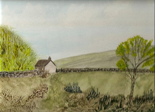
What is wrong with this. Is it the tree? Is it too green? I am at a loss but it just doesn't look right to me. It is still on the board so I can add to it and alter it still. I wondered about a horse grazing in the fronn field sort of behind the tree ( I can do ponies/horses)
If you keep searching you'll find it |
Julie in Norfolk
|
Posted - 08/02/2008 : 12:09
I am an absolute rank amateur so I shall only express my opinion as you seem to be looking for some feedback. Everything on the painting looks well executed to me.
The focal point is the house and everything about the picture draws you in toward the house, but there is also an inbalance left to right. The left is "heavier" than the right.
Measure with a micrometer.
Mark with a pencil.
Cut with an axe. |
Sue
|
Posted - 08/02/2008 : 12:37
Yes I think That is what I was feeling but don't really know how to rectify it. If I make the right hand tree too big I would think it would draw away from the cottage
If you keep searching you'll find it |
Another
Traycle Mine Overseer


6250 Posts

|
|
Posted - 08/02/2008 : 13:41
Sue, I'd be tempted to pull a little more colour from the background field and perhaps then add a very light blue wash to the same area to take it more into the background. Also I'd put some more darks in the trees particularly the one in the foreground and bring the leaves on that tree lower down the trunk giving the impression that they are on the front of the tree as you look at it.
Alternatively its fine as it is so leave it alone. Nolic
" I'm a self made man who worships his creator"  |
Sue
|
Posted - 08/02/2008 : 15:53
I've always been very apprehensive about doing washes, so youthink the hill is too prominent. In the original I must admit it was more bluish as if in the distance. In the original I just couln't get the perspective of the farmhouse and the walls. As for the front tree do you think it is too smalll then, Should i make it talller and more pronounced, thicker trunk?
Sue
If you keep searching you'll find it |
blokman
|
Posted - 08/02/2008 : 21:34
Great picture, Sue, speaking also as a rank amateur, but fresh from studying loads of books on the subject, I think I agree that the hills in the background might benefit from being paler and wonder if the field behind the tree would benefit from some horizontal brush strokes?
Rob
www.robinsharples.co.uk |
Sue
|
Posted - 08/02/2008 : 23:04
Yes I see what you mean, it is a little flat. I may have a go tomorrow after my MRI
Sue
If you keep searching you'll find it |
Another
Traycle Mine Overseer
6250 Posts
|
|
Posted - 09/02/2008 : 05:27
Sue, after I'd posted the above I cam to the conclusion that I'd make a better art technician than an artist. Its strange how you see things in others work and can come up with solutions that you miss when its so obvious in your own.
Certainly blue being a cold colour would push your hill more to the background. If you do add some more darker leaves to the foreground tree then may be widen the trunk on the right in a darker colour - light coming from left.
If your paper is as good a quality as it seems if these ideas don't work you can always wash off again!!
Anyhow you have inspired me to have a go again later today. I have a winter scene of New York's Central Park from a Christmas card that I've had in mind to paint for a while. Very subtle whites and greys on the card . I can mix about three different greys, then have Paynes Grey and Neutral Tint straight. The snow will be the white of the paper with blue hues to emphasise shadow as I picked up recently that the most false looking snow is white. I have a pan of indigo that I will experiment with. Now this has got me thinking as I have some tinted papers that I got in a freebie pack and I think I have a light blue... if I use that I can maybe do some snow in either white gouche or well watered acrylic.
One further matter. I have recently come across an American artist from the early to mid 20th C called Edward Hopper. Have a Google and look at some of his work. I'm hooked on it at the moment and have his "Leeward Shore" as a desktop wallpaper.... or will have after replacing "Misty in the snow " ... again. Nolic
" I'm a self made man who worships his creator" |
Sue
|
Posted - 09/02/2008 : 10:10
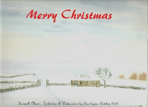
I have done a couple of winter scenes with snow in my various classes . We masked edges of walls, rooves and branches. Painted the main snowy scenes in a pale bluey violet, footprints in a darker version of the same solour. After removing the masking fluid we just touched up the areas with a bit of the same colours I may have put this one on before, but no harm in doing it twice
I actually made it into a Christmas card both in French and English. Unfortunately the definition does not scan very well. Once again I thank Jeremy Ford for the use of his original idea
Sue
Edited by - Sue on 09/02/2008 10:12:54 AM
If you keep searching you'll find it |
portia
|
Posted - 09/02/2008 : 11:31
Sue, I know absolutely nothing about painting - except I'm a whizz at decorating - but I think the painting's lovely. The only thing that strikes me is that the tree in the foreground seems to be leaning out of the picture and drawing the eye away from the scene.
Wish I could paint like that!
Edited by - portia on 10/02/2008 22:29:38
If you can't fight, wear a big 'at |
Sue
|
Posted - 09/02/2008 : 11:40
Yes , I thought it was leaning too far to the left.
As for not being able to paint, neither could I until 2 years ago. I had never put brush to paint since I was 12.(some 46 years ago) I found a couple of classes, there seem to be loads around. Both classes have beginners and amateurs. Its a good social group too, we have a laugh. I am still not very good left to my own devices, I am much better led through by the teacher. HENCE the picture I want comments on, all my own work after I had washed off the one I did in the class, which was PATHETIC!!!!
Sue
If you keep searching you'll find it |
portia
|
Posted - 09/02/2008 : 11:53
Please don't persuade me into another hobby - since I 'retired' I've taken up scrapbooking & family treeing. They've taken over my life (and my dining room).
But I'm even more impressed if that's what you've achieved after only 2 years.
If you can't fight, wear a big 'at |
Sue
|
Posted - 09/02/2008 : 13:14
I too have found plenty of hobbies to fill my retirement. Gardening, particularly growing fuschias, and herbs, watercolour painting, quilting and patchwork, card making, gone back to sewing, and we are doing up a house in Brittany. Oh yes walking, gym and swim ( all on temporary hold whilst I have this bad back) family tree and local history. AND I squash it all into a shorter day because I don't like mornings!!!!!!
Sue
If you keep searching you'll find it |
Another
Traycle Mine Overseer
6250 Posts
|
|
Posted - 10/02/2008 : 07:55
Thanks Sue for getting me in the mood.
I managed to get a good start on my Central Park. Background sky and buildings almost completed and middle ground bushes and snow done. Typical... all going very well then tried to push to finish before France vs Ireland ( what a great entertaining match) and I went into a building not quite dry and it cauliflowered. Will need to tidy up. Runs like that are normally fine but this is quite a precise little painting and the blot is quite out of place. Found the blue paper which only has a very slight tint but its a smooth "not" paper and very nice to work on.
Nice using small flat brushes for quite detailed work, I forgot how versatile they can be. Nolic
" I'm a self made man who worships his creator" |